Fill out our form, and we'll connect with you within 1 to 2 business days.
Phone: (925) 989-7737


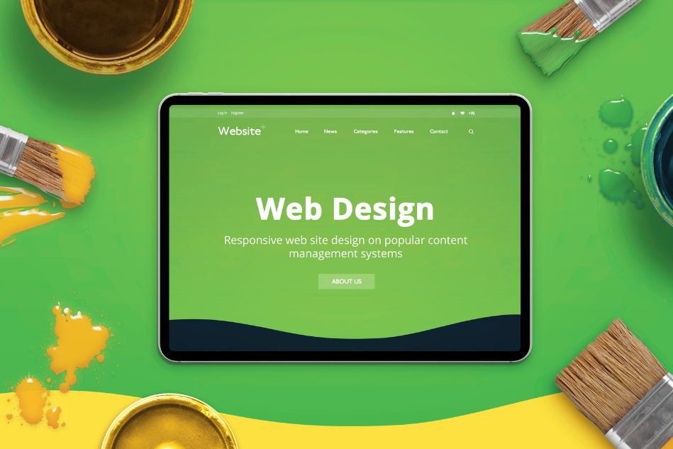
Website typography is important for a highly reliable website. When people think about web design, they typically envision colours, layouts, or images. But one design element that quietly shapes your visitors’ entire experience is typography design.
The right website fonts can instantly make your brand look polished, modern, and trustworthy. The wrong choices? They can make even the best content feel amateurish.
Website Typography is more than picking a “pretty” font—it’s about readability, hierarchy, and consistency. Let’s explore practical typography tips for professional web design that can make your website feel more credible and engaging.
Website Typography is the lens through which all your written content is experienced.
It impacts:
Your fonts should reflect your brand identity.
Pro Tip: Stick to two fonts max—one for headings and one for body text—to keep things consistent and professional.
Even stylish fonts fail if your visitors struggle to read them.
Always test your typography on desktop and mobile.
People don’t read websites word for word—they scan. Hierarchy helps them find what they need quickly.
How to build hierarchy:
Nothing looks less professional than fonts that change style across pages.
Consistency = trust and credibility.
Over half of web traffic comes from mobile devices, so your typography must adapt.
Website Typography isn’t just about fonts—it’s about the space around them. White space helps content breathe.
Clean spacing makes your typography design feel modern and professional.
Professional web design = inclusive design. Make sure your fonts work for all users.
Accessibility boosts both trust and SEO.
Website Typography is never “one and done.” Small changes can improve user experience and engagement.
Try A/B testing:
Collect feedback and refine until your typography supports—not distracts from—your message.
When done well, typography fades into the background and simply makes your content shine. That’s the secret to professional web design.
Typography might seem like a small detail, but it’s one of the most powerful ways to elevate your website. With the right typography design and consistent use of website fonts, you’ll create a polished experience that keeps visitors engaged and builds trust.
Want help perfecting your typography or designing a truly professional website? At 360 Web Designs, we specialize in creating sites that are beautiful, functional, and brand-aligned. Let’s bring your vision to life.