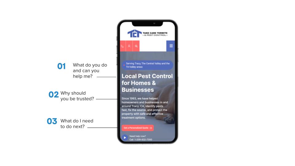
When someone lands on your site, you have about 3 to 5 seconds to grab their attention. In that time, your page needs to answer three questions:
- What do you offer?
- Who is it for?
- Why should they care?
This messaging needs to appear “above the fold,” meaning visitors shouldn’t have to scroll to understand what your business does.
Do this:
- Write a clear headline, not a clever one. Clear wins.
- Add a short subheadline for support.
- Include one strong call-to-action.
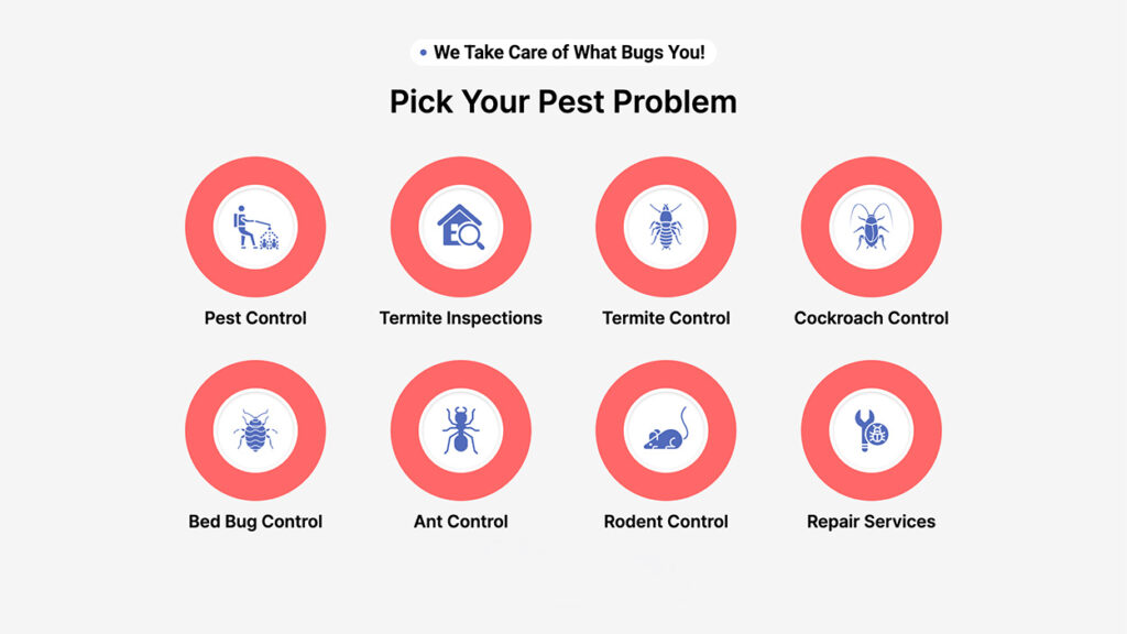
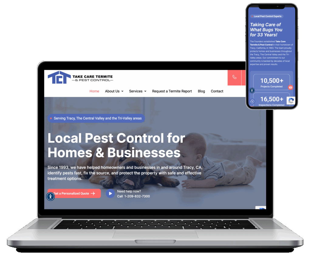
For example, instead of the company tagline, “We Take Care of What Bugs You!”, try “Local Pest Control for Homes & Businesses.”
View Project
2. Strategic Calls to Action
Calls-to-action, or CTAs, are the buttons and links that tell people what to do next. Without them, visitors land on your page, get curious, and then leave because they don’t know their next step.
A good CTA:
- Appears once as the main action per page
- Uses clear, direct language
- Shows up in more than one place (top, middle, and bottom of the page)
Try phrases like “Get Your Free Quote,” “Book a Consultation,” or “Start Your Project Today.” Skip vague CTAs like “Learn More.” Tell people what they’ll get, not just where to click.

3. Make It Easy, or They’ll Leave
Your site can look great and still lose customers if it’s hard to use. This is where user experience, or UX, comes in: how intuitive and easy your site is to navigate.
Focus on:
- A simple menu (5 to 7 items max)
- Fast load times (under 3 seconds)
- Content organized in a logical order
- Minimal clutter and distractions
Every extra click, delay, or confusing moment gives a visitor one more reason to leave.
4. Most of Your Visitors Are on Their Phones
Over 60% of website traffic now comes from phones. If your site isn’t built for mobile first, you’re losing customers before they even see what you offer.
A mobile-friendly site should:
- Adjust cleanly to any screen size
- Stay easy to read without zooming
- Keep buttons and CTAs easy to tap
Watch out for buttons that are too small to tap, text that’s too small to read, and pages that load slowly on mobile. Mobile usability isn’t an afterthought; it’s where most of your customers will meet you first.
5. Why Should They Trust You?
People don’t buy from businesses they don’t trust. Adding proof that you’re credible helps ease hesitation and gives visitors the confidence to take action.
c
- Customer testimonials
- Case studies
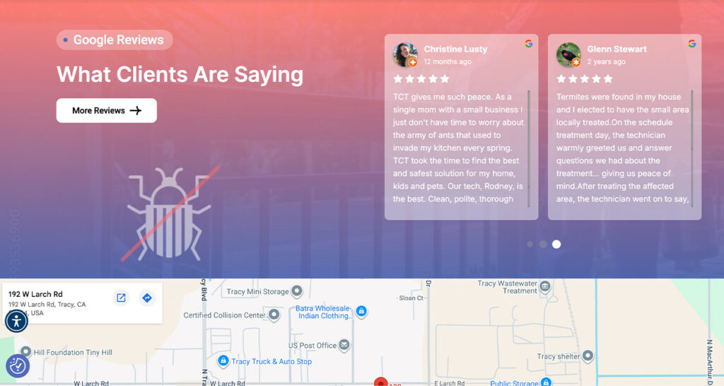
- Google reviews
- Certifications or awards
- Secure payment icons (if you sell online)
Placing these near your CTAs works especially well. Right when someone’s deciding whether to act, a little reassurance goes a long way.
6. Write Content That Sells, Not Just Informs
Content isn’t just there for search engines. It’s there to persuade. Use it to walk visitors through their decision-making process with this simple structure:
- The problem they’re facing
- Your solution
- The benefits of that solution
- Proof it works
- A clear call-to-action
This mirrors how people naturally think through a purchase, so your content should follow the same path.
7. One Page, One Goal
Landing pages are different from your homepage. They exist to drive one specific action, with nothing else competing for attention.
A strong landing page has:
- One clear headline
- One CTA
- Minimal navigation (or none at all)
- Strong visuals
- Copy focused on benefits, not features
Test different headlines, images, and CTAs regularly to see what performs best.
8. How to Show Up When People Ask Google a Question
Search is changing. People aren’t just typing keywords anymore, they’re asking full questions, often out loud. This is called AEO, or Answer Engine Optimization, and it helps your website show up as the answer in featured snippets, voice search, and AI-generated results.
To optimize for this:
- Use question-based headings, like “What is a high-converting website design?”
- Give clear, direct answers right after the question
- Use bullet points and short paragraphs
- Add an FAQ section to your pages
Example: “What is a high-converting website design? It’s a website built to guide visitors toward a specific action, like making a purchase or filling out a form, through smart layout, content, and user experience.”
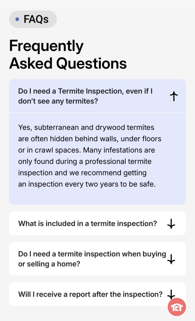
Client FAQ section optimized for AEO
9. Get Found by Customers Near You
If you serve a specific area, like Dublin, California, your website needs to clearly tell search engines where you do business. This is called GEO, or Geographic Optimization.
Ways to do this:
- Mention “Dublin, California” naturally in your headings and content
- Keep your Google Business Profile up to date
- Create pages for specific service areas
- Add local schema markup (a bit of code that tells search engines your location)
Instead of a generic service page, try something like “Website Design Services in Dublin, California That Drive Results.” This helps you show up for searches like “website design Dublin, California” or “web designer near me.”
10. Slow Site? You’re Losing Customers Every Second
Page speed affects both your search rankings and your conversions. Aim for load times under 3 seconds, strong Core Web Vitals scores, and a page free of unnecessary scripts and heavy files.
You can check your speed with free tools like Google PageSpeed Insights or GTmetrix. Keep in mind: a 1-second delay can cost you up to 7% of your conversions.
11. Stop Guessing. Start Testing.
A high-converting website is never really “done.” It keeps improving through ongoing testing, known as CRO, or Conversion Rate Optimization.
Useful tools include:
- Heatmaps, which show where people click
- Session recordings, which show how people move through your site
- Conversion tracking
- A/B testing
Keep an eye on your conversion rate, bounce rate, time on page, and click-through rate to see what’s working.
12. The Psychology Behind Why People Click
Good design isn’t just about looking nice; it taps into how people think and make decisions. High-converting sites use:
- Contrast to make CTAs stand out
- White space to make content easier to read
- Visual cues, like arrows or images, to guide the eye
- Color psychology (red or orange for urgency, blue for trust, green for action)
13. Traffic Doesn’t Pay the Bills. Conversions Do.
Plenty of websites focus on getting more visitors and forget to think about what happens once they arrive. SEO and conversion strategy need to work together.
To align them:
- Target keywords with real buying intent
- Match your content to what searchers actually want
- Optimize your meta titles and descriptions
- Make sure your landing pages deliver on what the search promised
14. Guide Visitors Deeper Into Your Site
Internal links, links from one page on your site to another, keep visitors engaged, help search engines understand your site, and spread authority across your pages. A simple example: link your blog posts to relevant service pages, and vice versa.
15. Look and Sound Like the Same Business Everywhere
Consistency builds trust and recognition. Make sure your colors, fonts, tone of voice, and messaging stay aligned across every page of your site.
View Project
Ready to Turn Your Website Into Your Best Salesperson?
A high-converting website isn’t just about looking good; it’s about strategy, psychology, and performance working together.
When you combine clear messaging, strong CTAs, smooth UX, AEO for modern search, and GEO targeting for Dublin, California, you get a website that doesn’t just attract visitors. It turns them into customers.
If your current site isn’t delivering the results you need, it might be time for a redesign. Let’s turn your traffic into measurable business growth.
Want a website built to convert, tailored to your audience and your location? Now’s a great time to start. Follow us on Facebook and Instagram for more tips on turning your website into your hardest-working employee.