Fill out our form, and we'll connect with you within 1 to 2 business days.
Phone: (925) 989-7737

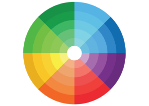
There is a lot to understand about color theory. If you are a painter, or a designer, you need to know the terminology and the reasoning behind it. But if you are letting the professionals do their job,as you should do, just knowing some basic terms and color combination tips can be enough to help make smart choices for your website.

Carefully chosen colors for your website can create a mood, a feeling of sophistication or playfulness. Color is a first impression tool that can be one of the primary introductions your brand. It can entice a user to click into your site. Too much of a strong saturated color can be overwhelming. A balance of strong, eye catching logo color, photos, clickable items, and subdued backgrounds for text make it easy for the reader to intuitively know where to look.
360 WEB DESIGNS listens to the mood a business is hoping to present with their website, and uses color to design in a complementary way.