Fill out our form, and we'll connect with you within 1 to 2 business days.
Phone: (925) 989-7737

If links are broken, or they take the user to an unrelated page, the user may get frustrated quickly. Check and update links and forms often; at least once a month. A maintenance program is good to have so that when things go wrong, you have a webmaster to help fix issues quickly.
Easy navigation ranks high in user satisfaction. Imagine what customers want to see first, second, and third, then show these buttons, call outs and images close to the top of the home page. Button titles need to be clear and to the point. Users like interesting design, but most businesses should use layouts that are tried and true. Unless they are judging the newest funky website designs, the user wants comfort and ease of use.

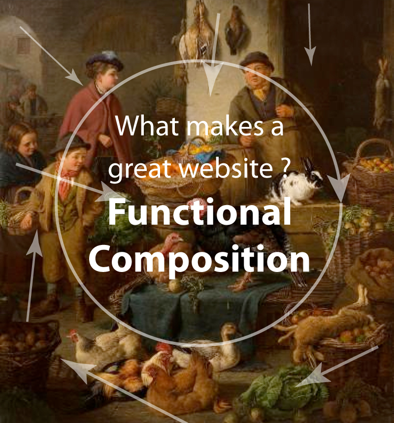
Did you know that artists and designers are manipulative? When they want the viewer to focus on something, or many things in a particular order, they create Compositional Flow. Notice how the direction of the door arch in the upper left background points to the woman, and she is looking at the man? The direction, color, contrast, and line creates a movement or flow, pulling ones eye around the painting, and then in to the center, where the children are looking.
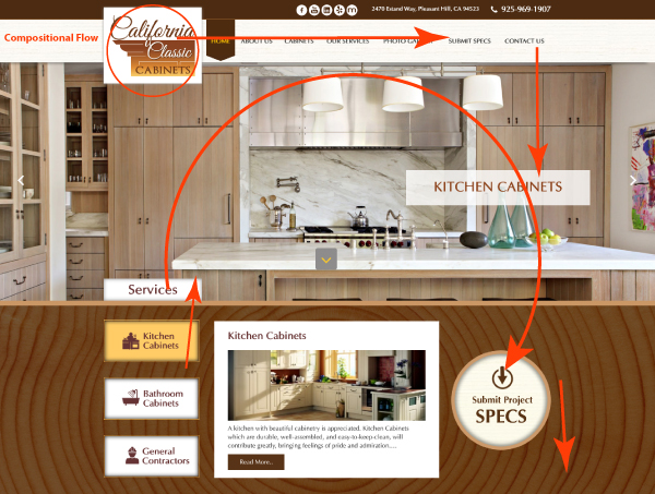
 In website design, this same technique can be used to create directional patterns and draw the eye to key areas. Bold text, sliding images, and Call to Action items help manipulate the eye to follow.
360 WEB DESIGNS uses professional designers and programmers to create compositionally correct sites that function with the latest WordPress features.