Fill out our form, and we'll connect with you within 1 to 2 business days.
Phone: (925) 989-7737

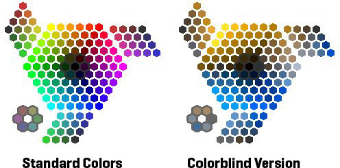
Color blindness, or color impairment, affects 4-8% of males, and less than 1% of females. How these people see content on all devices, from TV, to text books. And with the internet as the number one way people research and find new services and businesses, how you use color in your website could potentially help or hinder new customers. One in twenty of your customers could be color blind.

Above is an example of what a color blind person may be seeing. Selecting Colors for a Design Project, from hotdesign.com has more about design and color theory.
Choosing great color combinations for your logo, content, and navigation on your website is high priority for 360 WEB DESIGNS. We are aware of color and eyesight issues and design accordingly. First we evaluate if your customer base is more or less likely to fall into the parameters of these sight issues. We use black, white and gray for initial comps to determine an appropriate amount of contrast. When color is added, certain color combinations are avoided.
These color combinations are the hardest for users with color issues:
Check in again next week for more graphics and color in web design by Annette Frei at 360 WEB DESIGNS.