Fill out our form, and we'll connect with you within 1 to 2 business days.
Phone: (925) 989-7737


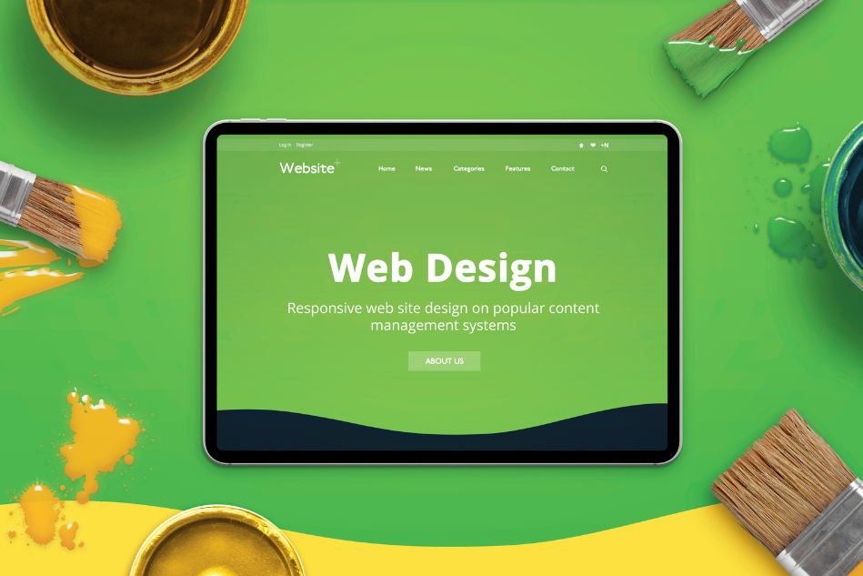
Discovering color psychology in web design for impact is important before creating your website. When you first land on a website, what’s the very first thing that grabs your attention? More often than not, it’s color. Before you even start reading, colors set the tone. They quietly shape how you feel, how you think, and even whether you stay and explore or bounce away. That’s the power of color psychology in web design.
Whether you’re building a business website, designing a personal portfolio, or refreshing your online store, understanding how colors affect emotions can help you create a stronger connection with your visitors. The truth is: color isn’t just about aesthetics. Let me tell you a secret. It’s about strategy.
In this blog, we’ll dive into the psychology of colors in web design, why it matters, and how you can use website aesthetics and smart design strategies to win over your audience.
Think of color as the unspoken language of design. It communicates messages and feelings instantly, even before a single word is read. For example:
The colors you choose aren’t just decoration—they’re subtle influencers guiding how your audience perceives your brand and interacts with your website. A poor choice of color palette can confuse visitors, while a well-thought-out scheme makes your brand memorable and inviting.
Imagine walking into a physical store. The lighting, the colors on the walls, the way products are displayed—it all impacts whether you feel comfortable and want to stay. The same principle applies online.
Your website aesthetics should reflect your brand’s identity and values. Bright, bold tones might work for a youthful brand selling trendy products, while softer, muted palettes might suit a professional consultant or a wellness coach.
The goal is simple: make your visitors feel “at home” when they land on your page. If your colors align with your brand message, you’re more likely to build trust and keep people engaged.
Here’s a quick breakdown of what different colors can signal when used in web design:
Of course, colors can carry cultural differences, but these general associations are powerful guides when shaping your design strategies.
Now that we understand how colors influence perception, the next step is learning how to apply this knowledge effectively. Here are some practical design strategies to keep in mind:
Ask yourself: What do I want people to feel when they visit my site?
If you’re a law firm, you may want trust and professionalism (blue, black, gray). If you’re running a bakery, warm and inviting tones like cream, pastel pink, or soft brown might create the perfect atmosphere.
A timeless interior design rule works wonders in web design too:
This keeps your website aesthetics clean and balanced without overwhelming visitors.
Your color choices shouldn’t just look good—they should also make content easy to read. Ensure there’s enough contrast between text and background. A beautifully designed site loses its impact if visitors struggle to read your words.
Use bold colors sparingly to direct attention. For example, if your website has a “Sign Up” button, make it stand out with a contrasting accent color. This subtle use of color psychology nudges users to take the action you want.
Your website, social media, and marketing materials should carry a consistent color scheme. This builds a strong, recognizable brand identity and ensures visitors always know they’re engaging with you.
These examples prove that design strategies rooted in color psychology don’t just make sites beautiful—they make them effective.
If you’re still unsure where to start, here’s a simple step-by-step approach:
Your website is more than just text and images. It’s an experience. By thoughtfully applying color psychology, you’re not only improving your website aesthetics but also creating emotional connections that drive action.
The next time you’re designing or refreshing your site, don’t just pick your favorite color. Ask yourself: What story do I want my brand to tell? Then use your color palette to bring that story to life. We can help you make it happen.
Remember: the right color choice can turn a casual visitor into a loyal customer. That’s the hidden magic of design strategies built on color psychology. Let’s talk about it.